

Your P95 latency doubled after a deployment. Your average cost-per-call looks fine. A dashboard of aggregate numbers tells you something changed — but not what changed, or for whom.
This is the gap between metrics and understanding. Summary statistics compress the shape of your data into a single number, and in doing so, they erase the patterns that actually explain what's happening. A bimodal latency spike — where half your requests are fast and the other half are stuck — looks identical to a uniform slowdown when reduced to a P95. A long tail of expensive LLM calls disappears into a healthy-looking average.
DBNL's Distribution tab was built to close that gap. It lives inside the Explorer — the primary analytical surface in DBNL's observability platform, where engineers and data teams investigate trends, compare distributions, and trace agent execution paths across their LLM-powered applications. The Distribution tab is where you go when you need to move beyond trend lines and summary stats: it lets you visualize the full shape of any metric across your agent traces and compare that shape between two filtered populations, side by side on a shared axis. This post walks through why distribution analysis matters for LLM agent observability, the real-world use cases it unlocks, and the design decisions that make it work.
Why distributions matter for LLM agent analytics
LLM-powered agents are inherently non-deterministic. The same prompt can produce wildly different execution paths, token counts, latencies, and costs depending on model behavior, tool-call branching, and context length. This makes aggregate statistics especially unreliable — a mean or percentile can mask the multimodal behavior that agents routinely produce.
Distribution analysis answers the questions that summary metrics can't:
- Is this a uniform shift or a population split? When latency increases, a distribution reveals whether all requests slowed down or whether a subset is stuck while the rest are fine. This distinction changes the debugging approach entirely — a uniform shift points to infrastructure, while a bimodal split points to specific code paths or input characteristics.
- Where does the mass actually sit? Knowing that P95 latency is 8 seconds tells you nothing about the other 94%. A histogram shows whether most requests cluster tightly around 200ms with a thin tail, or whether the distribution is flat and unpredictable. The former is a healthy system with occasional outliers; the latter is a system with a reliability problem.
- How do two populations actually differ? Comparing "error traces vs. successful traces" or "experiment A vs. experiment B" with summary stats gives you two numbers. Comparing their distributions shows you where they diverge — maybe errors only occur in a specific latency band, or maybe the cost distributions are identical except for a spike at the upper extreme.
Use cases: when to reach for distribution comparison
Debugging production regressions
Your alerting fires on a P95 latency spike. You open the Distribution tab, select `duration_ms` at the trace level, and create two segments:
- Segment A:
status = error - Segment B:
status = success
The histogram immediately shows the story. Successful traces cluster in a tight band around 300ms. Error traces show a completely separate mode at 12–15 seconds — they're not just slow, they're hitting a timeout boundary. The regression isn't a uniform degradation; it's a specific failure path that's pulling the P95 up. You now know exactly which traces to drill into.
Evaluating experiment variants
You've shipped a new prompt template optimized for cost efficiency — the Trends tab confirms average `total_cost` dropped 8%. But cheaper doesn't mean better. Did the leaner prompt sacrifice output quality?
In the Distribution tab, you select `output_relevancy` — an LLM-as-judge metric that classifies each response as "relevant" or "irrelevant" — and create two segments using experiment filters:
- Segment A: Experiment variant
`control` - Segment B: Experiment variant
`new-prompt-v2`
The histogram makes the trade-off immediately visible. In Relative mode, the control prompt produces irrelevant responses roughly 10% of the time. The new prompt doubles that to 20%. The cost savings are real, but they come at the expense of output quality for one in five requests. This is the kind of regression that an average relevancy score won't catch — it's only visible when you compare the full distribution of outcomes side by side.
DBNL's filter builder supports experiment-level filters natively, so setting up this comparison takes seconds. You select the experiment, pick the variants, and the histogram updates immediately — no need to export data, write SQL, or build a notebook.
Comparing model providers or versions
You're evaluating whether to migrate from one model version to another. Beyond just checking average quality scores, you want to understand the full distribution of your custom evaluation metrics.
Set up two segments filtered by model version, select your LLM-as-judge score column, and toggle to Relative mode. Even if one model version has 10x more traffic, the normalized view lets you compare distribution shapes directly. You might find that the new model has a tighter distribution (more consistent quality) even if the averages are similar — or that it eliminates the low-quality tail that was driving user complaints.
Validating guardrails and thresholds
You've set a 45-second timeout on agent execution. How much traffic is actually approaching that boundary?
View the `duration_ms` distribution across all traces, then add a segment filtered to `duration_ms > 40000`. The relative mass of the near-timeout population tells you whether the guardrail is an edge case or a significant portion of your traffic. If 12% of traces are within 5 seconds of the timeout, you have a systemic issue — not an outlier problem.
Understanding user cohort behavior
Do power users and new users drive different workload profiles? Filter your session-level `duration_ms` distribution by a user cohort attribute and compare. You might discover that new users have short, simple sessions that cluster tightly, while power users produce a broad, flat distribution — indicating they're pushing the agent into diverse, long-running workflows that need separate performance optimization.
Design decisions: why DBNL's distribution tab works
Building a distribution comparison tool sounds straightforward — render a histogram, add a filter. In practice, most implementations fall apart when they try to generalize. Here's how we approached the hard design problems.
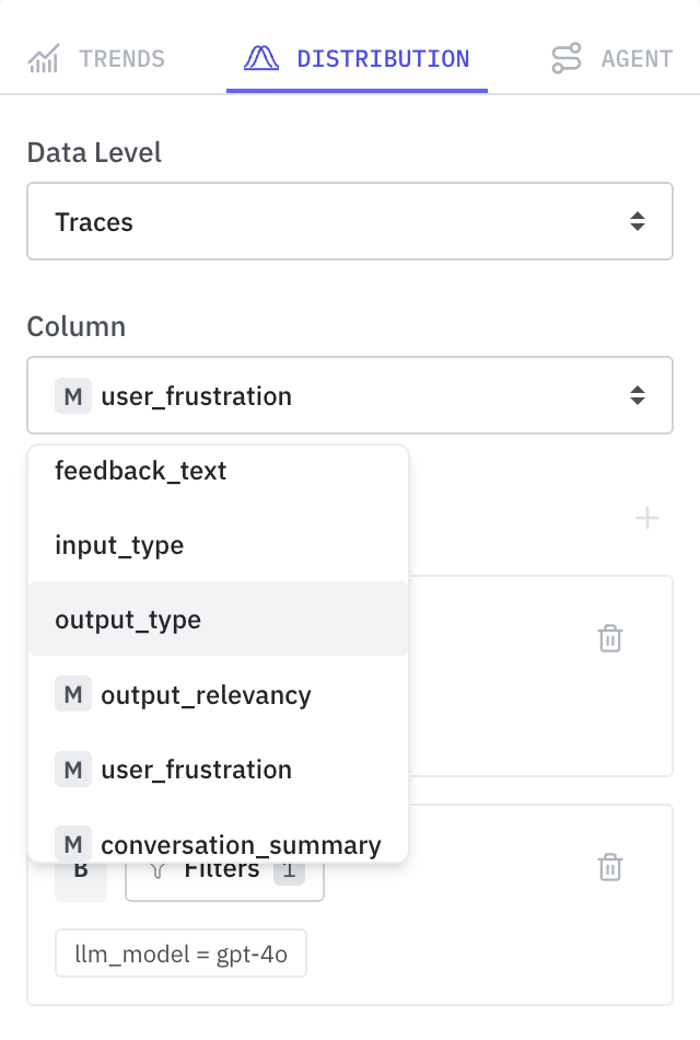
One column, varied filters — not varied columns
An early design considered letting users compare distributions of different columns side by side — latency vs. cost, for example. We ruled this out intentionally.
Different columns can have fundamentally different data types and scales. A numeric column like `duration_ms` produces a continuous histogram with range-based bins. A categorical column like `status` produces a bar chart with discrete labels. Overlaying these on a shared axis is meaningless: the X-axis semantics don't align, the bin boundaries are incompatible, and the Y-axis scales can differ by orders of magnitude. Even comparing two numeric columns breaks down when one ranges from 0–100ms and another from $0–$50.
Instead, the comparison axis is filters on the same column. This guarantees both segments share the same data type, the same bin boundaries, and the same axis scale. The question shifts from "how does column X compare to column Y?" to "how does column X behave under condition A vs. condition B?" — a question that only a shared-axis histogram can answer clearly.
This constraint doubles as a guardrail: every valid input produces a coherent chart. Users can't accidentally build a visualization that's broken or misleading.
Two segments, not more
We capped the segment limit at two. This was a deliberate constraint, not a technical limitation.
Histograms are fundamentally different from line charts. A line chart can layer many series legibly because lines occupy different vertical positions and the eye tracks each one independently. Histogram bars compete for the same horizontal space. With three or more segments, bars within each bin become too narrow to read, hover targets shrink below useful thresholds, and the cognitive load of tracking color mappings across dozens of thin slices outweighs the analytical value.
Two segments cover the dominant use case — A/B comparison. "How does this metric look for errors vs. non-errors?" "Production vs. staging?" "Experiment A vs. B?" — these are the questions that distribution comparison exists to answer, and all of them are two-population problems.
Grouped bars, not overlaid or separated
With two segments to display, there are three reasonable bar layout approaches. We evaluated all three:
- Overlaid (semi-transparent bars stacked on top of each other) is common in statistical tools. It works when distributions differ significantly, but when they overlap heavily — the common case in A/B comparisons — the colors blend and individual values become impossible to read. Worse, hover and click targeting becomes ambiguous. In a drilldown-heavy interface where clicking a bar navigates to filtered logs, ambiguous click targets are a non-starter.
- Fully separated (two side-by-side charts) eliminates overlap but makes direct comparison harder. The user's eye has to travel between charts and mentally align bin positions. Subtle shape differences become invisible. Each chart is also compressed to half the available width, reducing visual resolution. It turns a comparison task into a memory task — hold the shape of one chart in mind while looking at the other — which is exactly what good visualization should eliminate.
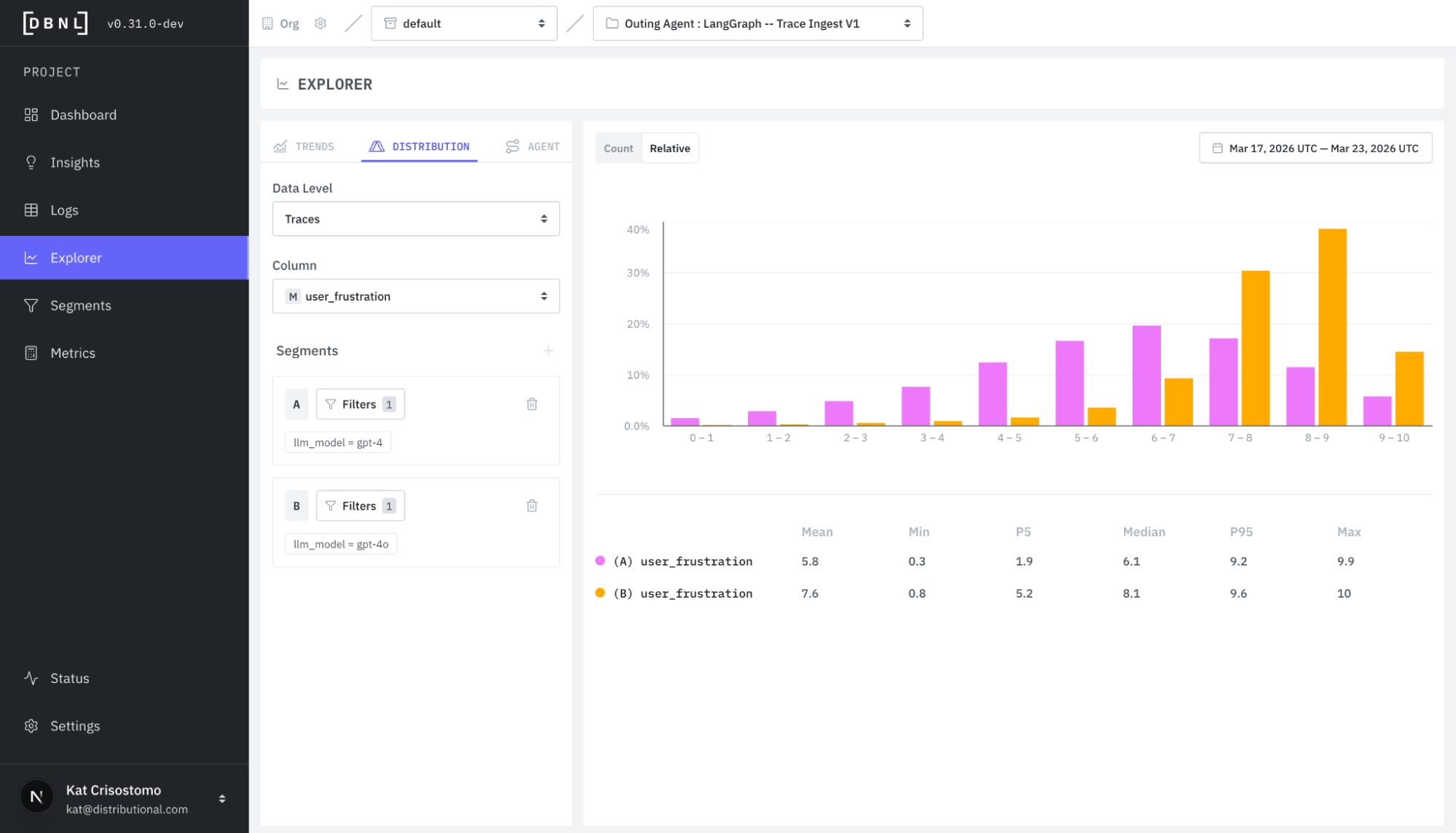
- Grouped (bars side-by-side within each bin) is what we chose. Each bin gets a pink bar (Segment A) and an orange bar (Segment B) sitting next to each other. Spatial proximity makes per-bin comparison instant. Click targets are unambiguous. The distribution shapes remain visually intact because each segment's bars form a continuous silhouette. The trade-off is that individual bars are narrower than in a single-segment view, but with bin count controlled by the backend, this stays readable.
Count vs. relative: two lenses on the same data
The chart toolbar provides a Count/Relative toggle that switches the Y-axis between raw counts and normalized ratios. This is essential for comparing segments of different sizes.
If Segment A has 50,000 traces and Segment B has 5,000, count mode will show Segment A visually dominating every bin — making shape comparison impossible. Relative mode normalizes each segment independently (each sums to 1), so the chart shows shape rather than volume. Two bars of similar height in relative mode confirm the distributions have the same shape. Height discrepancies in specific bins reveal exactly where they diverge.
The grouped bar layout makes this toggle especially effective. In count mode, you see volume differences. In relative mode, you see shape differences. Both comparisons are legible with side-by-side bars in a way that overlay cannot support.
The bigger picture
Distribution comparison isn't a standalone feature — it's part of DBNL's connected investigation workflow. You can start with a trend line that shows a metric changing over time, click a data point to drill into the distribution for that specific time window, and then click a histogram bar to see the raw traces that fall in that bucket. Each step narrows the investigation, and each transition preserves context.
This is what purpose-built LLM agent analytics looks like. Not a generic charting tool with an AI label, but an opinionated system designed around the specific questions that agent developers ask: Is my agent reliable? Is it cost-efficient? Did this change make it better or worse — and for which users?
The Distribution tab answers the version of those questions that summary metrics can't reach. And in a world where agent behavior is inherently variable, reaching past the averages isn't optional — it's where the real understanding begins.
Get started
You can get started with these new features in less than 20 minutes with our free, open, and installable sandbox at https://docs.dbnl.com/get-started/quickstart. Once you are ready, you can also install our free, open full service in your own environment at https://docs.dbnl.com/platform/deployment.
We are always happy to learn more about your use case and enterprise needs, so reach out to contact@distributional.com with any questions.
Subscribe to DBNL
Thank you for your submission!
Oops! Something went wrong while submitting the form.